


Project Brief
“AKUT Training and Research Institute offers training and consultancy services on special study subjects determined in-house about risk and disaster directed to both domestic and international private sector and public with the mutual support of AKUT Search Rescue Association; does scientific research or ensures to be done; raise awareness of public.”
Challange:
AKUT Search and Rescue Association (Turkish USAR Team) is a well known association, the flagship of Research and Rescue of Turkey. They have a popularity and sincerity amongst people who suffered catastrophes like earthquakes, floods etc.
The AKUT Institute focuses on education of companies, prepping individuals for possible catastrophes; as well as giving conscience as an overall.
AKUT USAR had a logo that had many elements; a hand saving another, helicopter, fire on buildings, a mountain at the back… as well as a typographical one that said AKUT and Turkish and English versions of Reserch and Rescue all around it.
Idea:
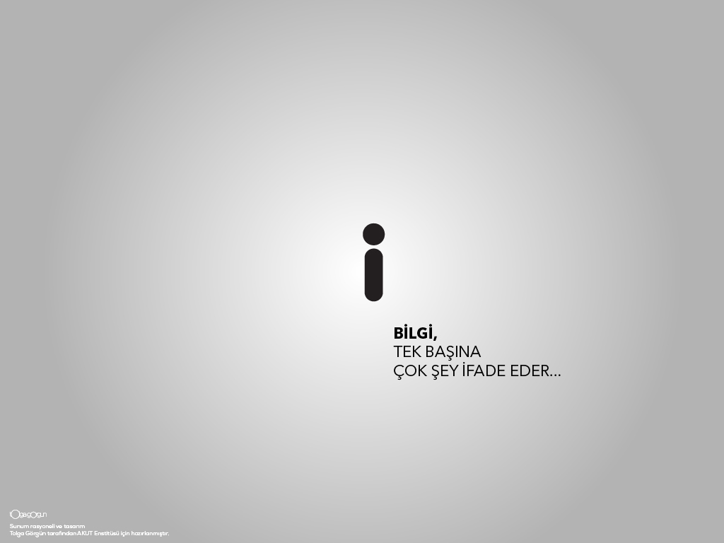
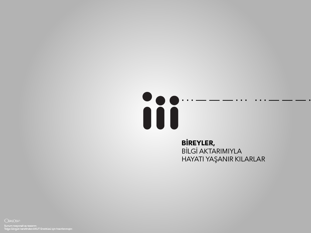
Institute had to have a simpler way of telling things.
I chose MORSE CODE S.O.S. signal as the main idea behind the logotype. S.O.S is the stress code for help in case of emergencies, formed up by three dots, followed by three lines and three dots again. They resemble the periods and frequency of the signals for the acronym S.O.S.
A lot of people think that the distress signal is an abbreviation for “save our souls” or “save our ship.” But in reality, “save our souls” and “save our ship” are backronyms, and the letters don’t actually stand for anything.
In fact, the signal isn’t even really supposed to be three individual letters. It’s just a continuous Morse code string of three dots, three dashes, and three dots all run together with no spaces or full stops (…—…). Since three dots form the letter “S” and three dashes form an “O” in International Morse code, though, the signal came to be called an “SOS” for the sake of convenience. That connection has led to the letters coming into their own as a visual distress signal divorced from Morse Code, and those in need of rescue sometimes spell them out on the ground to be seen from above.
Agency: Study-O | Tolga Görgün Tasarım
Logotype Design: Tolga Görgün
Rationale and copy: Tolga Görgün
Branding Materials: Tolga Görgün
Web Site Design and development: Tolga Görgün, Berkan Dirim
AKUT USAR LOGO’S

Applied Design Samples

