Project Brief
Husband-and-wife team Ataç and Akgonca Besi left behind the Istanbul hustle in 2009 to establish their family-owned small batch brewery in Yesilyurt village. Inspired by craft brews around the world, Gara Guzu, or ‘kara kuzu’, means black sheep. It sounds different, pronounced with a Mugla accent. It’s born different, a pioneering Turkish local that offers the world a rebel spirit alongside local handmade quality, all natural ingredients and flavor.
The brand’s logo design has a prize by the Turkish Graphic Designers Community (GMK).
Challange:
This was so far the hardest round of design series I challenged. The first round of ideas were again focused around a typographical approach; which were not we were happy with. Having a designer’s block back then; it was even harder for me to come up with an innovative rationalé.
The couple even incorporated an illustrator friend; whose approaches were all turned down by the approval center TAPDK; they were found too figurative and too stimulating/promotive (?) for the buyers.
Idea:
Then it was clear we needed a typographical approach.
The idea was simple
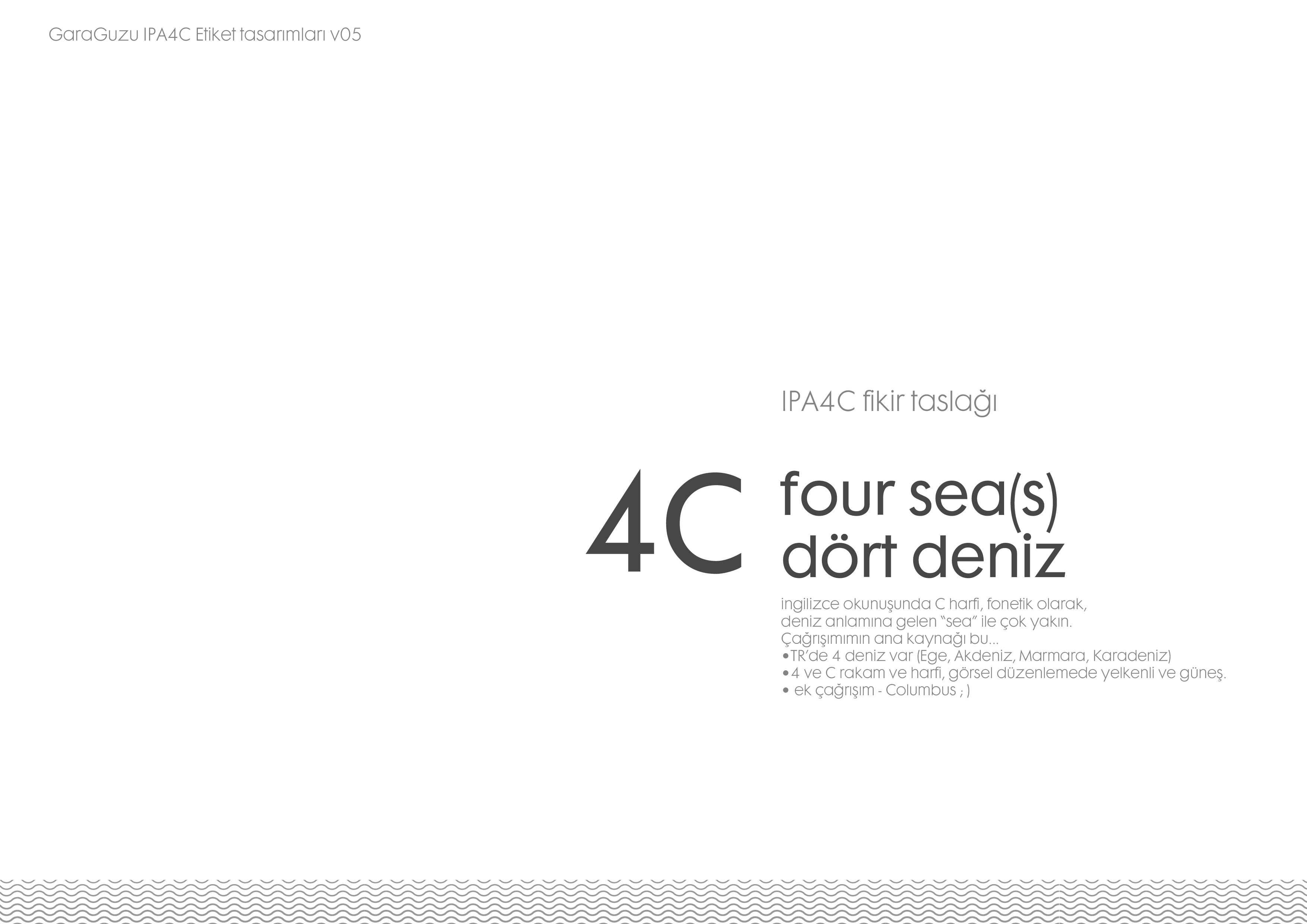
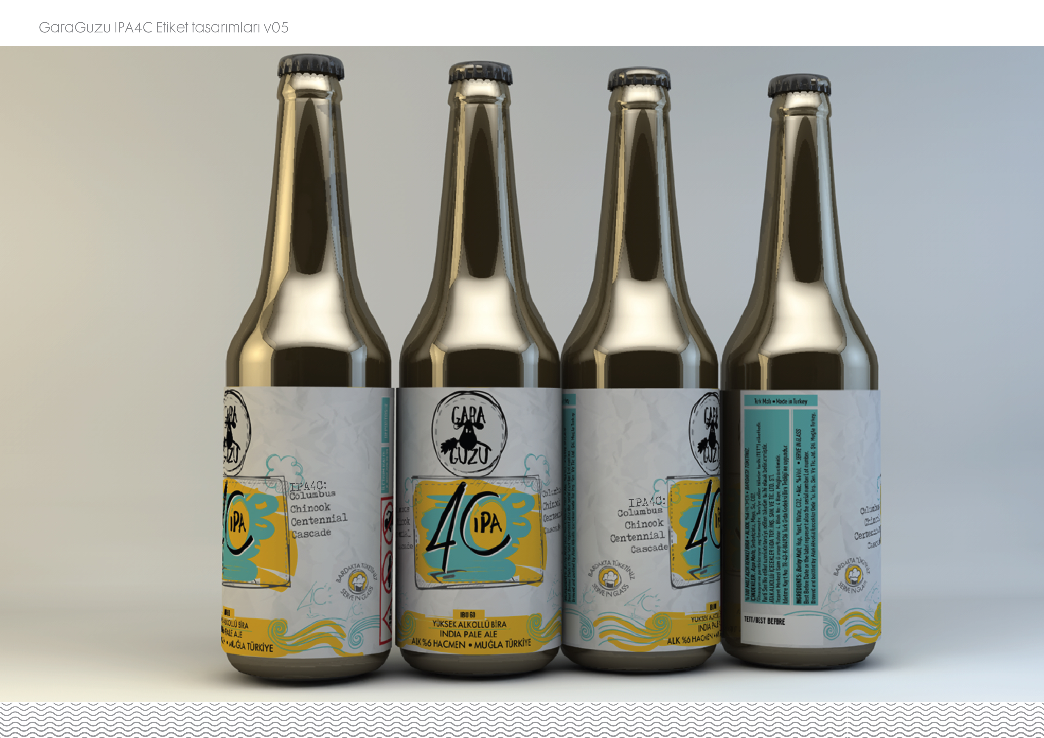
4C has 4 different hops in it all starting with the letter “C”.
Chinook, Columbus, Cascade, Centennial.
the phonetic of the letter reading as “SEA” was the main resolution; which linked it all to Turkey having 4 seas surrounded by ;)
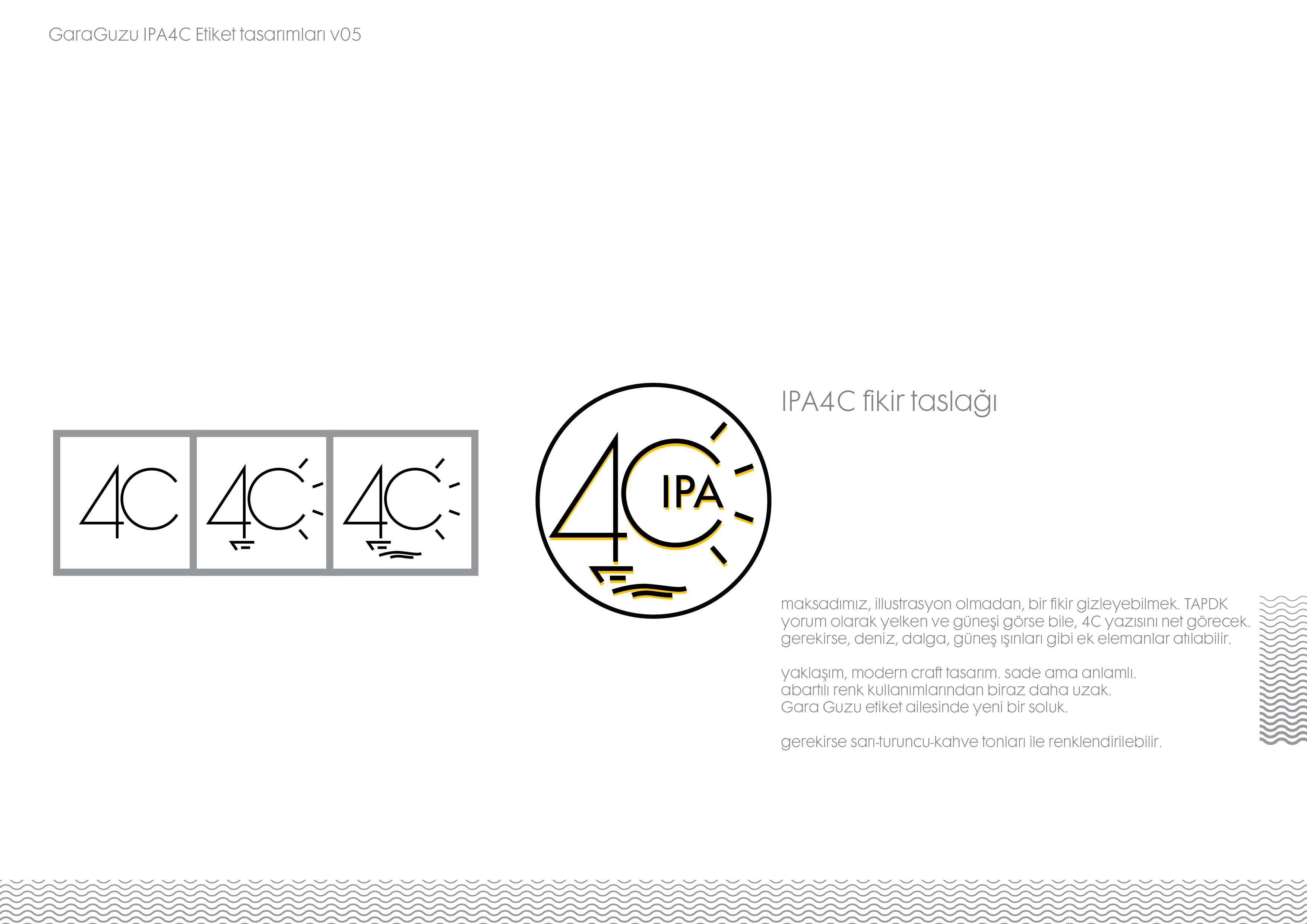
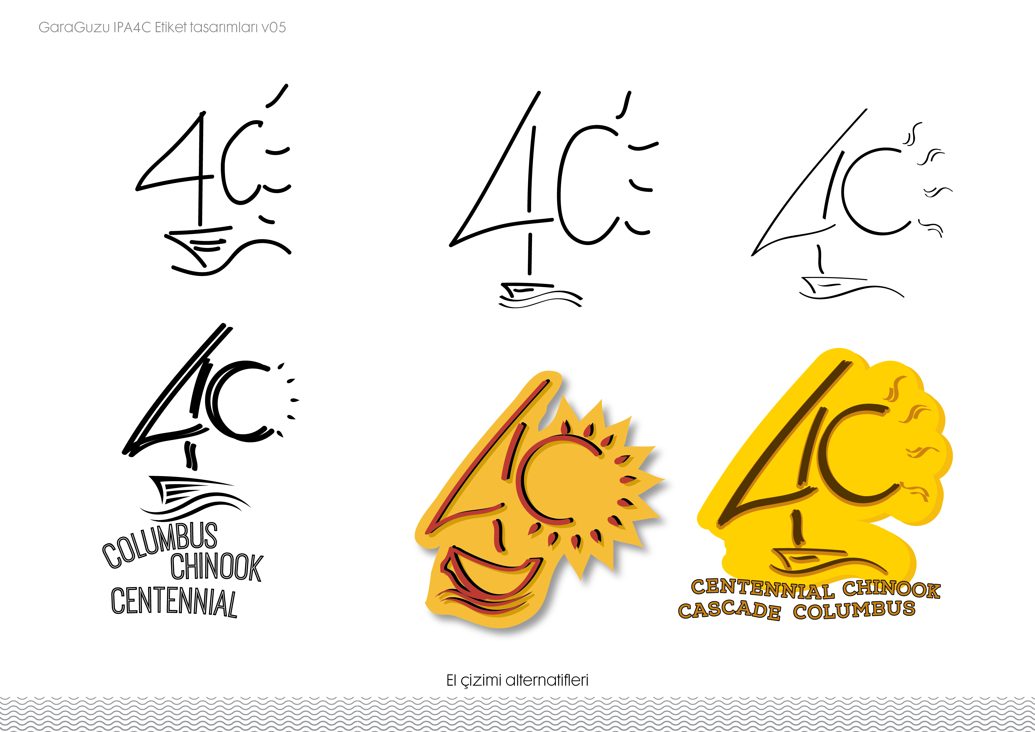
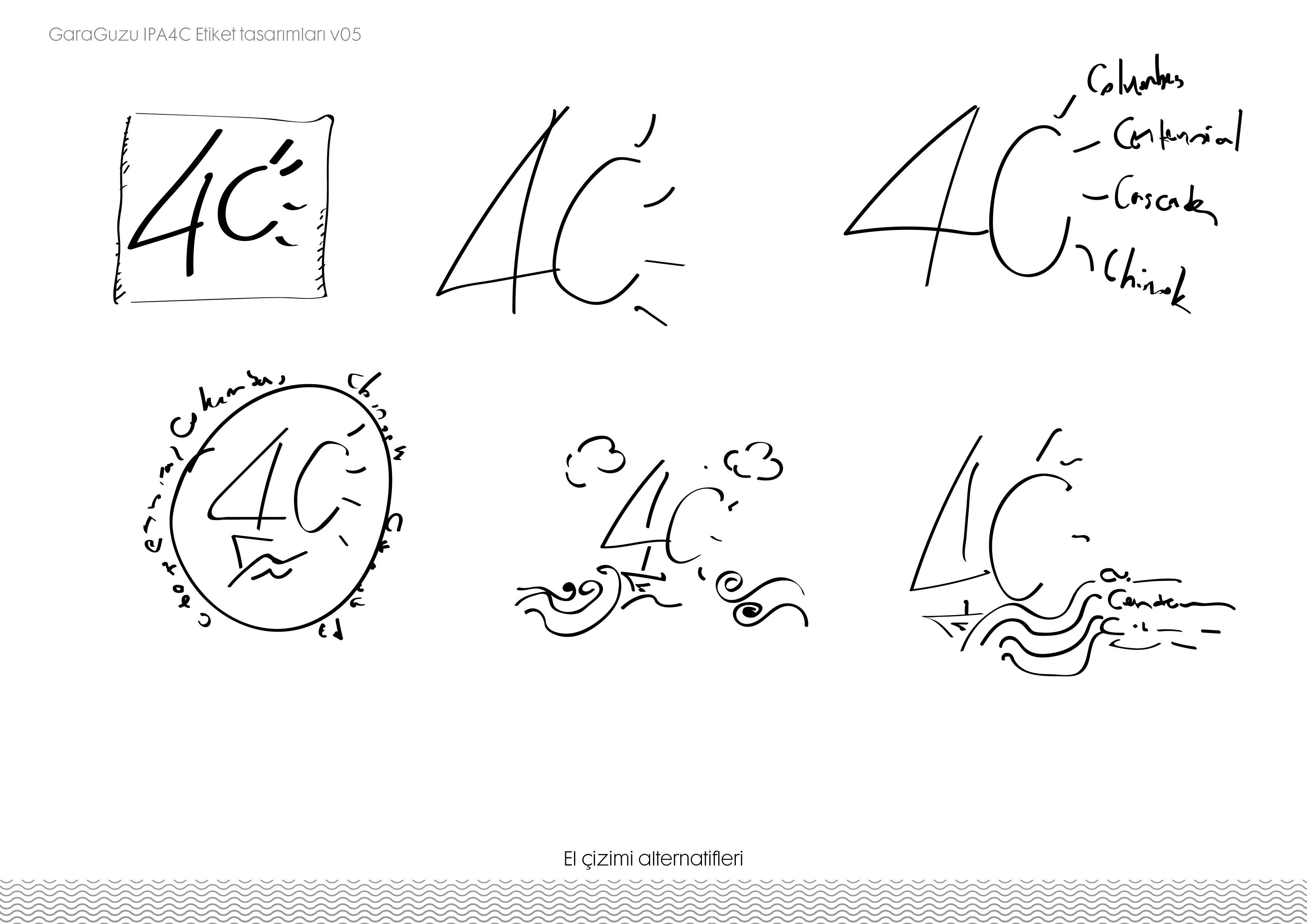
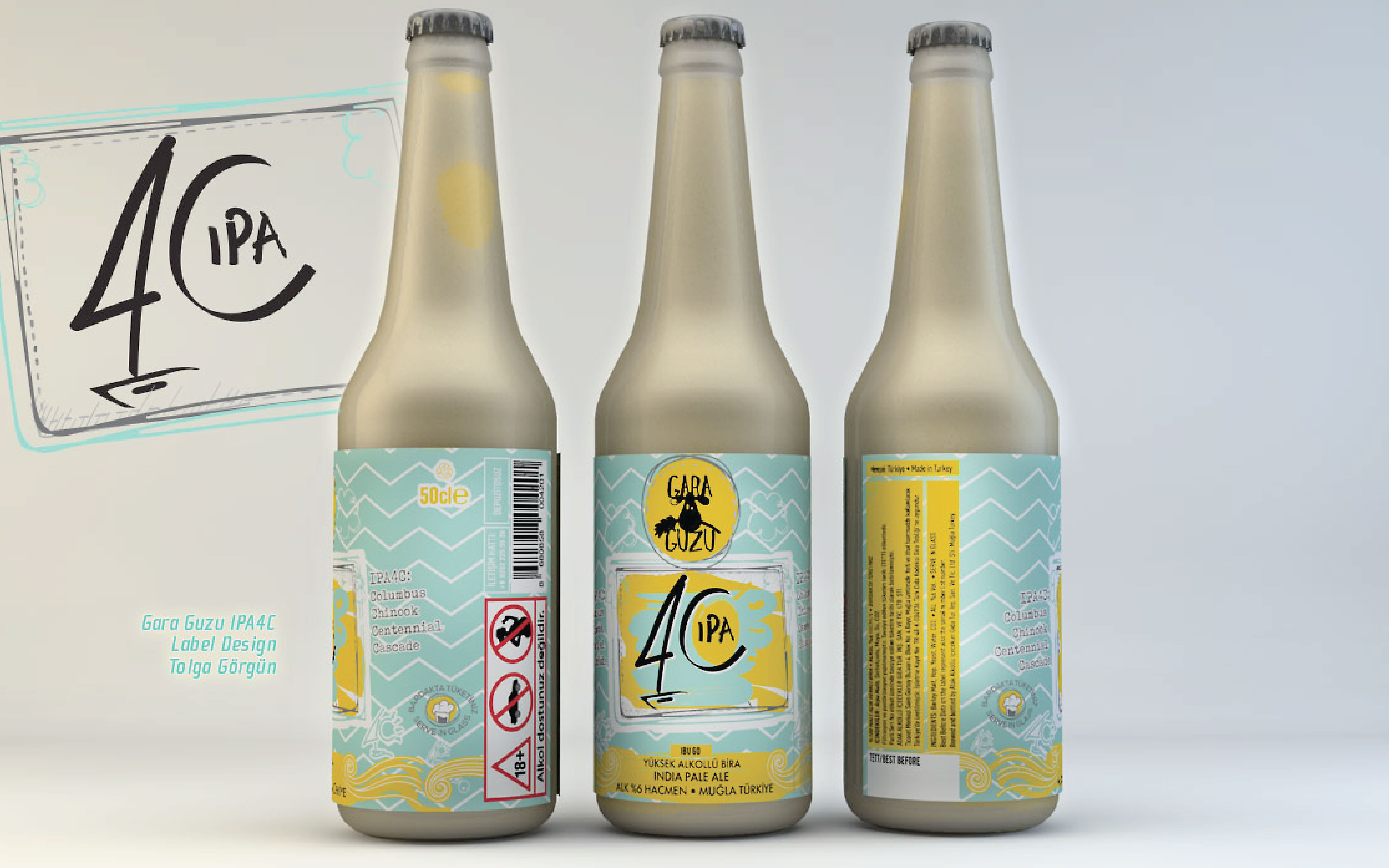
The number “4” resembling a SAIL and the letter C having a sunset feeling solved the whole problem. I did some sketches both digitally and analoguely.
The copule were finally happy with the approach. As a final touch we added a sea wave-ish patternt to the background to give the whole bottle a lively feeling.
SO here it is : ]
cheers.

Logo Design: Burcu Kayalar / Katalist
Bottle label design: Tolga Görgün
Branding Materials: Tolga Görgün
Turkish rationale and hand drawn sketches of the idea
