Project Brief
Husband-and-wife team Ataç and Akgonca Besi left behind the Istanbul hustle in 2009 to establish their family-owned small batch brewery in Yesilyurt village. Inspired by craft brews around the world, Gara Guzu, or ‘kara kuzu’, means black sheep. It sounds different, pronounced with a Mugla accent. It’s born different, a pioneering Turkish local that offers the world a rebel spirit alongside local handmade quality, all natural ingredients and flavor.
The brand’s logo design has a prize by the Turkish Graphic Designers Community (GMK).
Challange:
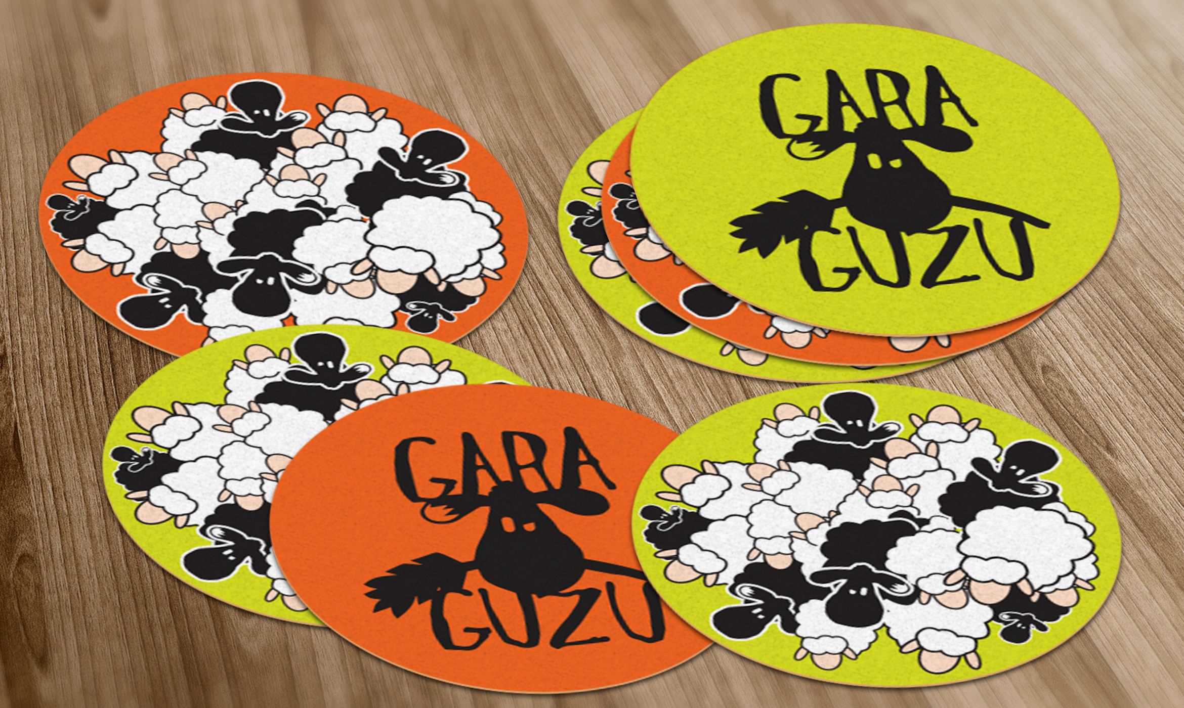
Being a fan of the brand and its products (Blonde ale being my favorite), I was familiar with the attitude and sincerity of the owners already. They have a language I am familiar with; being the “Black Sheep” of the hird. I was first asked to design beer mats for the brand. I was so happy to find out that the two colors I chose (Flourescant green and orange) were the couple’s favorite colors; we warmed up very fast to work together.
The brand had already had 6 beers produced, all having an identical language of their own; and the new Saison Beer should have a similar language with its brothers and sisters; also having it’s unique name and look.
Idea:
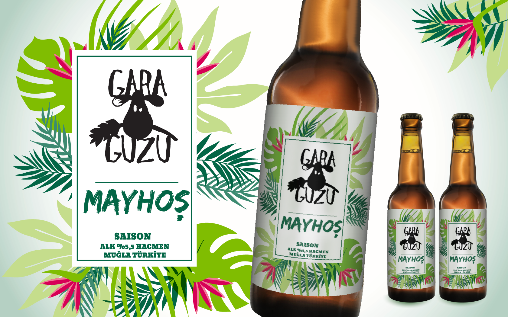
First round of ideas were mainly focused around the taste being sour. The Saison is a pinkish ale, known as “the wine of the beers.
Before ven tasting it, the idea was to give a green, pink flora fauna look to the label. After tasting it it was obvious we made a good choice with the label.
: ]
Logo Design: Burcu Kayalar / Katalist
Bottle label design: Tolga Görgün
Branding Materials: Tolga Görgün


